Houston Crime Map: Real-Time Data, Hyper-Local Insights & How to Navigate Houston’s Safety Landscape
Houston Crime Map: Real-Time Data, Hyper-Local Insights & How to Navigate Houston’s Safety Landscape
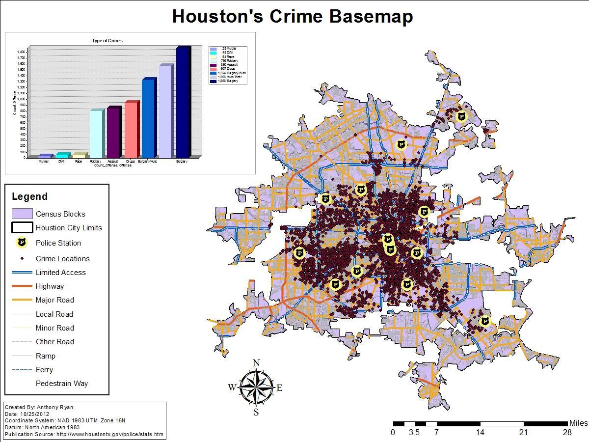
Across Houston, residents and visitors are turning to interactive crime mapping to make sense of neighborhood safety in a city defined by its sprawl and diversity. The Houston Crime Map, powered by the Houston Police Department (HPD), offers near-real-time visualization of reported incidents, transforming abstract statistics into street-level intelligence. This article explores how the map works, what the data reveals, and how to use it responsibly without stoking fear or misinformation.
How the Houston Crime Map Works: Data, Sources, and Technology
The Houston Crime Map is a public-facing component of HPD’s crime analysis and transparency initiatives. It displays geocoded crime data pulled directly from the department’s records management system, typically with a slight delay to allow for report validation and corrections. Each colored icon on the map represents a categorized offense, with filters that let users isolate crime types, date ranges, and precinct boundaries.
- Data Source: Crime reports filed with HPD, including arrests, citations, and supplemental reports.
- Geocoding: Addresses are converted to geographic coordinates for precise mapping; some crimes appear as “off-campus” or in areas without specific addresses.
- Temporal Lag: The map generally reflects data from the past several weeks, not live incidents, to ensure accuracy and investigative integrity.
- Categories: Offenses are grouped into classifications such as violent crime, property crime, narcotics, and theft.
The system runs on a backend built to handle millions of data points, with updates nightly or several times weekly depending on volume. HPD crime analyst units review and categorize each report before it appears on the map, applying uniform coding standards that align with FBI Uniform Crime Reporting (UCR) guidelines.
Interpreting the Map: What the Colors and Categories Mean
Understanding how to read the Houston Crime Map is essential to avoid misinterpreting hotspots as destiny. A cluster of red icons does not automatically mean an area is “dangerous,” but rather that more reports have been filed there, which can reflect everything from proactive policing to high population density.
Common categories include:
- Violent Crime: Homicide, robbery, aggravated assault, and rape.
- Property Crime: Burglary, larceny-theft, motor vehicle theft, and arson.
- Theft From Motor Vehicle: Often concentrated in parking lots, apartment complexes, and event venues.
- Narcotics and Drugs: Sales, possession, and manufacturing incidents.
- Burglary Residential and Non-Residential: Break-ins targeting homes, businesses, and construction sites.
It’s important to note that the map shows reported crimes, not confirmed crimes or guilt. A reported theft may be unsubstantiated; a violent crime may be under investigation; some incidents are never reported by victims at all. For this reason, analysts urge the public to view the map as one lens among many for assessing neighborhood safety.
Using the Map Responsibly: Avoiding Misinformation and Fear
One of the biggest pitfalls of crime mapping is the potential to amplify fear through incomplete context. A neighborhood that appears red on the map might simply have more cameras, more residents willing to report, or a higher volume of nightlife and foot traffic, all of which can drive up incident numbers without reflecting actual risk.
To use the Houston Crime Map responsibly:
- Look at trends over time, not snapshots. A single week of data is statistically noisy; patterns emerge over months.
- Compare incidents to population and business density. More activity can simply mean more people and more opportunities.
- Cross-reference with other sources such as the FBI’s Uniform Crime Reporting statistics and local crime prevention councils.
- Remember that visibility equals reporting. Areas with more community engagement and surveillance often show higher numbers because more crimes are documented.
Houston criminologist Dr. Emily Torres notes, “Maps are powerful communication tools, but they can mislead if users don’t understand the underlying methodology. The goal should be awareness, not alarm.”
Crime Prevention and Community Engagement Through the Map
Beyond awareness, the Houston Crime Map is a practical tool for crime prevention. Neighborhood watch groups, property managers, and community organizations use it to identify patterns and coordinate responses. For example, if vehicle burglaries spike near a particular shopping center on weekend evenings, residents can push for increased lighting, private patrols, or targeted enforcement in that area.
- Apartment complexes use the data to advise residents on securing vehicles and units.
- Business districts analyze robbery trends to adjust staffing and lighting.
- Parents use street-level data to discuss safe routes to school and parks with teens.
- Event organizers coordinate with HPD to plan for large gatherings based on historical incident patterns.
HPD also uses the map internally to allocate resources, directing patrols to areas with rising theft or violent crime trends. This data-driven approach, when paired with community outreach, helps build trust and collaboration between residents and law enforcement.
Limitations and Criticisms of Crime Mapping
No crime map is perfect, and the Houston Crime Map is no exception. Critics point out that heavy reliance on reported data can skew perceptions, since marginalized communities may underreport due to distrust of police or fear of retaliation. Additionally, crimes without clear geographic points—such as domestic disputes or cybercrime—may be underrepresented, creating blind spots in the visualization.
There is also the risk of “mapping bias,” where historical over-policing in certain neighborhoods makes them appear perpetually high-crime, which can influence everything from property values to insurance rates. HPD acknowledges these limitations and continues to refine its data practices, including better tracking of unfounded reports and improving victim outreach to encourage reporting.
The Houston Crime Map in Context: National Trends and Local Insights
Compared to other major U.S. cities, Houston’s crime trends have fluctuated in line with national patterns, including spikes during the pandemic and gradual declines in certain categories since then. The city’s crime map allows for comparisons with past years, making it possible to see whether a spike is an anomaly or part of a longer-term trend.
For example, a user can toggle between “This Year” and “Previous Year” views to see if auto thefts are down in their precinct or if weekend nightlife violence is trending upward. Overlaying demographic and infrastructure data—though not directly available on the public map—can further enrich understanding when used by researchers and policymakers.
Tips for Getting the Most Out of the Houston Crime Map
- Bookmark the map and check it periodically rather than obsessing over daily changes.
- Use the date slider to review the past 30, 60, or 90 days for a more meaningful picture.
- Focus on crime types that personally affect you, such as property crimes if you rent or violent crime if you commute late hours.
- Pair the map with HPD’s crime prevention tips and community meetings.
- Report suspicious activity through proper channels; the map only reflects what is officially recorded.
The Bottom Line: Empowerment Through Transparency
The Houston Crime Map is not a crystal ball, but it is one of the most powerful tools available for understanding the city’s safety landscape. By presenting data in a visual, accessible format, it turns complex statistics into actionable information for residents, businesses, and leaders. Used wisely, it fosters informed decision-making, strengthens community-police partnerships, and contributes to a more transparent and resilient Houston.
Related Post

Crime on the Rise: Uncovering the Truth Behind Houston's Crime Map
Your Ultimate Guide To Safety In Houston Using Crime Maps
Houston Crime Map: Navigate the Data Behind the Headlines and Empower Your Safety Decisions


