National Grid Power Outage Map: Real-Time Blackouts, Status & Restoration Times
National Grid Power Outage Map: Real-Time Blackouts, Status & Restoration Times
Across the United Kingdom and the northeastern United States, millions of people now rely on a single digital dashboard to understand the stability of their local electricity supply. The National Grid Power Outage Map has evolved from a simple status page into a critical public utility tool, offering minute-by-minute insights into system-wide disruptions and localized faults. This article examines how this map operates, what data it reveals, and how it shapes communication between grid operators, officials, and the public during crises.
The modern energy landscape is defined by increasing complexity, with aging infrastructure, extreme weather, and the transition to renewables all placing new demands on the grid. In this environment, transparency and real-time information have become as vital as the electrons flowing through the cables. By tracking outages as they happen and documenting restoration efforts, the map serves both as an early warning system and a historical record of grid performance.
How National Grid Power Outage Map Works
The core function of the National Grid Power Outage Map is to translate a vast, invisible network of transmission lines, substations, and control systems into a format that the public can understand at a glance. The map does not rely on a single data source; instead, it pulls from a combination of automated sensors, utility SCADA systems, customer smart meter reports, and field crew updates. This multi-layered approach allows the platform to distinguish between a brief voltage flicker and a sustained, widespread blackout.
At the technical heart of the system is a geographic information system (GIS) that overlays outage data onto a detailed map of the grid. When a fault is detected, the system uses algorithms to triangulate the location and estimate the number of affected customers. This process is not instantaneous; it typically involves a confirmation phase in which automated signals are cross-checked against historical patterns and neighboring system states. Only once a preliminary analysis is complete does the incident appear on the public interface, color-coded by severity and duration.
Utility engineers and emergency response teams use a more advanced version of the same interface to coordinate repairs. From their consoles, they can reroute power where possible, dispatch crews to specific coordinates, and monitor the impact of each intervention in real time. The public map, while simplified, often mirrors these internal views with a delay, ensuring that residents receive consistent information whether they are checking a website or speaking to a call center agent.
Key Features and Data Points
The most immediately useful feature of the National Grid Power Outage Map is its ability to display current outages in an intuitive visual format. Rather than presenting a dry list of statistics, the interface translates data into symbols and colors that indicate the scope of the problem. A single flashing house icon might represent a localized issue in a rural village, while a shaded region in crimson denotes a major urban disruption affecting tens of thousands of homes.
- Incident Identification: Each displayed event is assigned a unique reference number, allowing customers to search for specific outages and retrieve detailed timelines.
- Estimated Restoration Times: Based on crew availability and the nature of the fault, the system provides rolling updates that adjust as work progresses or complications arise.
- Geographic Boundaries: By defining affected postcodes or neighborhoods, the map helps users determine whether their own address falls within the impacted zone.
- Cause Analysis: Where known, the platform annotates incidents with probable causes, such as weather events, equipment failure, or third-party damage.
These features combine to create a structured, almost narrative account of a chaotic event. Instead of merely announcing that “the power is out,” the map explains where, to what extent, and with what expected resolution. This level of detail is particularly important in large-scale emergencies, where rumors and misinformation can spread as quickly as the initial fault.
Recent Major Events and System Performance
To understand the real-world impact of the National Grid Power Outage Map, it is helpful to examine a few notable incidents in which the platform played a visible role. During Storm Eunice in early 2022, high winds caused widespread damage to overhead lines across southern England. Utilities reported that the map’s live updates helped manage the surge of customer queries, directing concerned residents to the most current information rather than repeating the same status messages over the phone.
In another instance, a fault at a major transmission node in the northeastern United States triggered a chain reaction that darkened neighborhoods in multiple states. Operators used the system’s predictive modeling to simulate different restoration scenarios, weighing the risks of rerouting power against the stability of adjacent circuits. Public communications, displayed on the outage map, kept communities informed about expected timelines and advised on safety precautions during the cold-weather response.
These cases highlight a crucial, if often overlooked, aspect of grid management: the difference between losing power and understanding why it was lost, when it might return, and what is being done to fix it. The map transforms a frustrating silence into a conversation, even if that conversation is mediated through a static website or mobile app interface.
The Human Impact of Grid Visibility
Behind every dot on the National Grid Power Outage Map is a household, a business, or essential service navigating disruption. For hospitals and care homes, access to accurate, real-time information can influence operational decisions, such as whether to transfer patients or initiate backup protocols. For remote workers and parents managing home-schooling, the map provides a framework for planning daily activities around an uncertain timeline.
Public confidence in utilities is closely tied to perceived transparency. When a company can show that it is monitoring a problem, assigning resources, and providing consistent updates, customers are more likely to tolerate inconvenience. Conversely, silence or vague promises during an outage can quickly erode trust, even if the technical challenges of restoration are genuinely complex.
- Reduced Inquiry Volume: Utilities have reported drops in call center traffic when outage maps are active and reliable, freeing staff to focus on physical repairs.
- Improved Safety Awareness: By displaying warnings about downed lines or unsafe conditions, the map can prevent accidents and encourage responsible public behavior.
- Community Coordination: Local groups and volunteer organizations often use the map to identify areas of greatest need, aligning donations and assistance with actual gaps in service.
Limitations and Ongoing Challenges
Despite its sophistication, the National Grid Power Outage Map is not without limitations. In rural regions, sparse sensor coverage can lead to gaps in detection, meaning that outages may be reported later or remain invisible on the interface until customers call in. Urban environments, while better monitored, present their own challenges, such as signal interference and the sheer density of simultaneous faults during major events.
The accuracy of estimated restoration times is another area of ongoing refinement. Weather delays, parts shortages, and unexpected complications can push back crews, leading to frustration when timelines shift. Utilities emphasize that the map provides estimates, not guarantees, and encourage customers to continue checking for updates as situations evolve.
Looking ahead, the integration of artificial intelligence and machine learning promises to enhance the system’s predictive capabilities. Instead of merely reporting outages, future versions of the map might forecast vulnerability based on weather forecasts, vegetation growth, and historical failure patterns. This transition from reactive to proactive management represents the next frontier in grid resilience.
The Role of the Map in Policy and Regulation
Policymakers and regulators have also taken note of the National Grid Power Outage Map, viewing it as both a public service and a compliance tool. In some jurisdictions, utilities are required to publish outage data and meet strict performance metrics regarding restoration times. The map provides a transparent record that can be audited, analyzed, and compared across regions and time periods.
Regulatory bodies can use aggregated data from the platform to identify systemic weaknesses, such as aging infrastructure in specific corridors or repeated failures under certain weather conditions. This information feeds into long-term investment decisions, influencing where subsidies, grants, and private capital are directed within the energy sector.
Equally important is the role of the map in public discourse. During extreme events, when questions about preparedness and response inevitably arise, the platform offers an objective reference point. Journalists, analysts, and officials can point to real-time data when discussing the effectiveness of the grid and the challenges of maintaining reliability in a changing climate.
How to Use the Map Effectively
For members of the public, understanding how to interpret the National Grid Power Outage Map can reduce stress and confusion during an outage. The first step is identifying the correct map for your region, as multiple operators often run separate but similar platforms. Bookmarking the relevant URL and saving it offline can ensure access even when internet connectivity is intermittent.
When checking the map, focus on the incident details rather than the color of the shading. The estimated restoration time is a moving target, subject to change as conditions on the ground evolve. If your area is affected, consider signing up for direct alerts, which can deliver updates to your phone or email without requiring manual checks.
Finally, use the map as a tool for situational awareness, not speculation. Avoid sharing unverified images or theories about the cause of an outage; official channels and the platform’s own incident notes are more reliable sources of information. By approaching the map with a critical but informed perspective, users can turn a symbol of disruption into a source of clarity and control.
Related Post
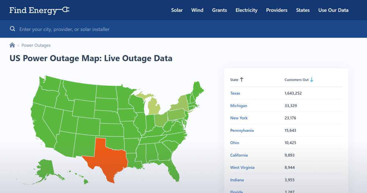
Mapping the Lights Out: How National Grid's Power Outage Map is Revolutionizing the Way We Think About Grid Reliability
Unlocking the Secrets of National Grid Power Outage Maps: A Glimpse into the World of Emergency Utilities
Live National Grid Power Outage Map: See Exact Blackouts in Real Time

Kristi Noem Plastic Surgery: Transforming Lives with Before and After Precision