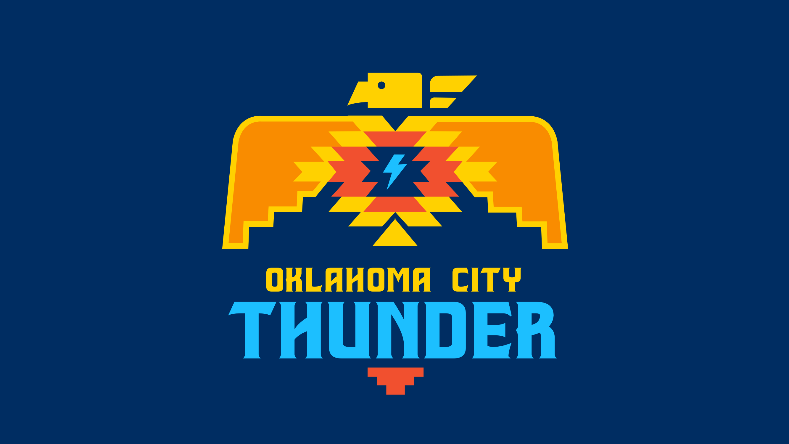
🔥 OKC THUNDER LOGO FONT 🔥 Designing Power: A Detailed Look at the Thunder’s Typography Identity
🔥 OKC THUNDER LOGO FONT 🔥 Designing Power: A Detailed Look at the Thunder’s Typography Identity
The Oklahoma City Thunder’s visual identity is engineered to evoke energy and dominance, with its custom typeface serving as the anchor for this design strategy. This specific font dictates how the team communicates across merchandise, digital platforms, and arena signage, creating a cohesive brand. Understanding this typographic choice reveals how a professional franchise translates athletic power into visual language.
The selection of a proprietary font is a strategic move common among major North American sports franchises, but the Thunder’s implementation stands out for its aggressive geometry. Unlike generic retail fonts used by predecessors, this typeface is a tailored asset meant to be instantly recognizable. It dictates the hierarchy of information, ensuring the word "Thunder" commands attention before a single game tip.
This deep dive examines the characteristics, applications, and impact of the Oklahoma City Thunder’s official lettering. We will explore the functional requirements of sports typography and analyze how this specific design supports the brand’s narrative in a crowded media landscape.
### The Anatomy of a Sports Brand Font
In the world of professional sports, a logo is more than a pretty picture; it is a functional tool that must perform under extreme conditions. The font chosen for a team name must be legible on a five-foot-tall arena banner, a tiny mobile app icon, and a embroidered patch on a practice jersey. Therefore, the primary characteristic of the Thunder’s font is its robustness. The strokes are thick, the counters (the enclosed spaces within letters) are large, and the terminals (ends of strokes) are blunt, ensuring the word remains identifiable even when scaled down or viewed from a distance.
Historically, many teams relied on stencil fonts or generic sans-serifs that conveyed toughness through angular shapes but lacked uniqueness. The Thunder, having originated as the Seattle SuperSonics and later relocated, had an opportunity to create something distinct during the 2008 relocation. The design language was built to reflect the dynamic energy of the "Thunder" name itself, translating the concept of lightning and explosion into visual form.
* **X-Height Optimization:** The height of the lowercase letters is substantial relative to the capital letters. This creates a "tall" appearance that maximizes readability in a single line, ensuring fans reading from the cheap seats can instantly process the message.
* **Weight Distribution:** The font utilizes extreme weight contrast, where the horizontal strokes appear much thicker than the vertical ones. This draws the eye horizontally, creating a sense of stability and impact that mirrors the power slam of a dunk.
* **Geometric Simplification:** Sharp corners are softened, and intricate details are stripped away. In a high-speed environment where fans process visuals in milliseconds, complexity is the enemy. The design removes friction, allowing for instant recognition.
### Application and Integration Across Media
A great logo font is useless if it is not implemented consistently across all touchpoints. The Oklahoma City Thunder employs a rigorous system to ensure that their typographic identity remains pristine, whether it is on a billboard or a digital ticket. This consistency reinforces brand memory and builds trust with the consumer.
**Merchandise and Apparel**
On physical merchandise, the font is often accompanied by a subtle gradient or a slight sheen to imply motion and energy. When the word "Thunder" is printed on a black jersey, it is usually rendered in a bright, electric yellow or white. The choice of fabric texture also interacts with the font; the slight roughness of cotton provides a tactile quality that mimics the grit of the court, making the graphic feel less like a commercial product and more like a badge of allegiance.
**Digital and Broadcast Integration**
In the digital realm, the font must adapt to responsive design. On a smartphone, the spacing between letters might automatically tighten to prevent the word from breaking awkwardly across two lines. Television graphics packages are perhaps the most critical test of the font’s durability. When score bugs appear on the screen during fast-paced action, the Thunder’s typeface must remain legible against the chaos of the background. The solid, blockish nature of the font ensures it never gets lost in the visual noise.
**The Arena Experience**
Inside Chesapeake Energy Arena, the font takes on a monumental scale. Large-scale installations of the team name often utilize three-dimensional letterforms. These car-cut letters are typically painted in the team’s primary colors and are mounted on the fascia of the scoreboard. The physical depth of these letters adds a layer of prestige and permanence, transforming the branding from a graphic into an architectural element of the venue itself.
### The Psychology of the Thunder Typography
Color and font choice are not arbitrary; they are psychological triggers designed to elicit specific emotional responses from the fanbase and opponents. The Oklahoma City Thunder utilizes a typeface that balances approachability with aggression. The rounded edges prevent the logo from feeling too cold or corporate, while the heavy weight ensures it feels powerful and uncompromising.
The choice to deviate from the traditional "Fire" font—a style often associated with wild, western branding—signals a shift toward modern sophistication. While the name references a natural disaster, the typography does not have to look chaotic. In fact, the controlled geometry of the font suggests mastery over that chaos. It implies that the energy of the storm is harnessed and directed, rather than wild and destructive.
This is a key distinction for a franchise looking to establish a sophisticated sports culture. As a team representative once noted regarding the brand evolution, the focus is on "projecting a very professional, very corporate image that [fans] can get behind and be proud of." The font is the visual vessel for that professionalism, translating corporate structure into athletic passion.
### The Evolution and Future of the Identity
Logos and fonts are not static; they evolve with the culture. The Oklahoma City Thunder has subtly refined its wordmark over the years. Minor adjustments to the kerning (the space between letters) and the slight sharpening of certain angles have modernized the look without abandoning its core identity. These tweaks ensure the brand remains fresh and competitive with newer, tech-forward franchises entering the league.
Looking forward, the font will likely continue to serve as the bedrock of the Thunder’s digital expansion. As the league moves further into streaming, social media shorts, and interactive fan experiences, the font must be versatile enough to function in square formats, circular overlays, and animated sequences. The strength of the current design is its flexibility; the distinct shape of the letters ensures they remain identifiable even when distorted or animated.
The Thunder’s font is more than just a way to spell "T-H-U-N-D-E-R." It is a calculated piece of visual engineering designed to communicate power, clarity, and modernity. It is the silent announcer that precedes the players onto the court, setting the tone for the energy to follow. As the franchise continues to build its legacy in Oklahoma City, the typography will remain the consistent element, the visual heartbeat of the organization that fans recognize long before the echo of the drum hits their ears.
Related Post