The Las Vegas Shooting Map: How Data Visualization Transformed Understanding of a National Tragedy
The Las Vegas Shooting Map: How Data Visualization Transformed Understanding of a National Tragedy
In the aftermath of the October 1, 2017 shooting, digital maps became critical tools for processing a scene too large to comprehend at once. These geographic visualizations served not only as records of the violence but as frameworks for understanding the scale and mechanics of the tragedy. This examination looks at how the mapping of that night reshaped public discourse, investigative journalism, and historical memory.
The creation of the Las Vegas Shooting Map represented a fusion of geographic technology and urgent public need. In the chaotic hours following the deadliest mass shooting in modern American history, official information was fragmented and often contradictory. Journalists, researchers, and citizens turned to digital mapping platforms to aggregate data points in real time. These tools allowed for the translation of chaos into coordinates, providing a skeletal structure on which the narrative of the night could be built.
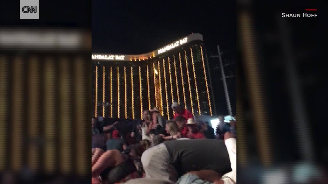
One of the primary functions of the digital map was to establish the physical boundaries of the incident. Unlike a singular event occurring at a fixed point, the Las Vegas attack was a distributed operation spanning a vertical and horizontal plane. The shooter, Stephen Paddock, had established his position high above the crowd on the 32nd floor of the Mandalay Bay Hotel. The projectiles—bullets—arcs of metal and flesh, created a cone of destruction aimed at the Route 91 Harvest music festival crowd on the ground. The map had to account for this three-dimensional aspect, a complexity rarely seen in two-dimensional crime scene diagrams.
Mapping the incident required the integration of multiple data streams. Official police reports provided the anchor points, marking the location of the shooter's final position and the discovery of explosive devices in his room. Emergency service radio logs, when plotted, revealed the frantic choreography of response, with ambulances converging on specific streets. Social media check-ins and geotagged photographs added a human dimension, marking where individuals had fled for safety. The resulting composite image was a dense layer of evidence that moved the story beyond abstract numbers.
These maps played a significant role in the journalistic investigation of the case. Outlets utilized spatial analysis to question the official timeline and the nature of the attack. Reporters mapped the travel path of the shooter’s companions, examined the logistics of ammunition transport, and tracked the acquisition of weaponry. The visual representation of these movements often revealed inconsistencies or logistical hurdles that were less apparent in textual reports. The map became a tool for verification, a way to test the plausibility of the narrative being constructed by authorities.
The technology behind these visualizations varied in sophistication. Some maps were simple static images, marking the venue of the concert and the location of the hotel. Others were interactive platforms, allowing users to toggle between layers of data. These more complex maps enabled the public to engage in spatial detective work. Users could isolate specific time stamps, observe the movement of crowds, and analyze the geographic gaps in the security perimeter. This interactivity transformed passive consumers of news into active investigators.
The concept of proximity became a central theme generated by the maps. Analysis frequently focused on the distance between the shooter’s window and the cluster of victims. This measurement served a dual purpose: it highlighted the terrifying efficiency of the attack and fueled the ongoing debate regarding "gun-free zones." The maps visually demonstrated that the venue was not a safe space, challenging the assumption that designated areas could prevent violence. The data suggested that the location of the threat was less a matter of the venue's policy and more a matter of the attacker's strategic positioning.
In the long term, the Las Vegas Shooting Map has become an artifact of historical record. It is utilized by academics studying gun violence, urban panic, and architectural security. The map functions as a primary source, a snapshot of a specific moment frozen in digital pixels. It captures the immediate geographic panic of the crowd, the strategic placement of the perpetrator, and the reactive scramble of emergency services. For historians, it provides a spatial database from which to analyze the event without the noise of immediate emotional response.
The reliance on geographic data also raised questions about privacy and ethics. The aggregation of location data from cell phones and social media, while useful for mapping human behavior, exists in a legal gray area. The maps that depicted the flow of survivors often did so by utilizing the very data trails that individuals left behind in their moment of flight. This created a paradox where the technology used to map the escape routes was also the technology that tracked the people escaping.
Furthermore, these maps have been instrumental in the advocacy surrounding gun control. Organizations opposing gun violence utilized the detailed visuals to argue for policy changes, emphasizing the scale of the damage inflicted from a single location. The map provided a counter-narrative to arguments about self-defense or the logistical impossibility of regulation. It visualized the potential radius of a massacre, making the abstract threat of gun violence frighteningly concrete for legislators and the general public.
In comparing the Las Vegas event to other mass casualty incidents, the unique role of the map becomes clear. Previous tragedies were documented through photography or film, static images capturing singular moments. The Las Vegas Shooting Map is dynamic; it is a living document that can be updated, annotated, and analyzed with layers of information. It moves beyond the singular image of carnage to provide a comprehensive geographic autopsy of the event.
The accuracy of these maps, however, was not always perfect. In the immediate chaos, data points were sometimes misplaced. Rumors circulated regarding the number of shooters and their locations, leading to misidentified coordinates on amateur maps. This highlights the double-edged nature of real-time mapping: while it democratizes information, it also risks spreading misinformation if not rigorously verified. The official maps released by law enforcement were eventually corrected and refined, underscoring the difference between public speculation and investigative fact.
Ultimately, the Las Vegas Shooting Map serves as a case study in how geography shapes our understanding of tragedy. It demonstrates that location is not merely a backdrop for events but an active participant in the narrative. The map forced a confrontation with the physical reality of the attack—the distances, the angles, the layers of security that failed. In translating data into visual form, it provided a framework for a nation struggling to make sense of senseless violence.
Related Post