The Psychology and Power of White Walls Grey Trim: How This Palette Defines Modern Sophistication
The Psychology and Power of White Walls Grey Trim: How This Palette Defines Modern Sophistication
White walls paired with grey trim represent a design equilibrium that balances brightness with grounding, creating adaptable spaces that feel both expansive and intentionally curated. This article examines the historical trajectory, psychological impact, and practical application of this enduring neutral palette, explaining why it remains a dominant choice in contemporary architecture and interior design. From maximizing natural light in compact urban apartments to providing a sophisticated backdrop for art and architecture in luxury estates, this specific color relationship offers a versatile foundation for personal expression.
The Historical Evolution of Neutral Palettes
The use of stark white as a primary wall color is largely a 20th-century phenomenon, moving away from the heavy, dark paneling and vibrant wall coverings of previous centuries. The introduction of synthetic pigments and modern formulations made pure, durable white paints widely accessible and affordable. Grey, traditionally associated with cement, stone, and utilitarian materials, transitioned from a mere byproduct of construction to a conscious design decision. The combination emerged prominently with mid-century modernism, which prized clean lines, natural light, and a sense of airy openness.
Architect Ludwig Mies van der Rohe’s mantra of “less is more” found a chromatic equivalent in this pairing. His Farnsworth House and other seminal works demonstrated how a limited palette of white and grey could create harmony, clarity, and a seamless connection between interior and exterior. This philosophy prioritized structure and materiality over ornamentation, allowing the inherent beauty of wood, metal, and glass to shine against the neutral backdrop.
The Psychology Behind the Palette
Color psychology plays a crucial role in the enduring popularity of white and grey. White is universally associated with light, purity, cleanliness, and simplicity. It reflects the maximum amount of light, making spaces feel larger, brighter, and more open. Grey, a neutral derived from mixing black and white, carries connotations of maturity, stability, sophistication, and practicality. It is the color of stone, concrete, and weathered metal—materials that suggest permanence and reliability.
When combined, these colors create a dynamic yet balanced sensory experience. The white acts as a vibrant, expansive canvas, while the grey trim provides structure, definition, and a sense of grounded calm. This contrast is visually satisfying without being jarring, allowing the eye to rest while still perceiving depth and architectural detail.
"Neutrals are not absence of color, but a sophisticated use of color. White and grey, when chosen with intention, create a serene and elevated environment that allows other elements—texture, form, and art—to become the focal point." — Elena Vance, Senior Color Consultant at the Pantone Color Institute.
Practical Applications and Design Flexibility
The versatility of the white walls, grey trim combination is its greatest asset. It serves as an ideal backdrop for a wide array of design styles and personal tastes. Here is how it manifests in different contexts:
- Modern Minimalism: In this context, the palette is used to its extremes. Walls are a crisp, pure white, and trim is a cool, charred grey. The focus is on clean-lined furniture, uncluttered spaces, and high-gloss or matte finishes that emphasize the simplicity of the form.
- Coastal Calm: Here, the white is often a warm, creamy white, and the grey trim is softened to a weathered driftwood or slate grey. This creates a relaxed, airy atmosphere reminiscent of a beach house, perfectly complementing natural fibers like jute, rattan, and linen.
- Classic Elegance: A traditional take might feature an off-white with a slightly greige (grey-beige) trim. This adds warmth and a sense of history, pairing beautifully with dark wood furniture, crown molding, and crystal fixtures.
- Industrial Edge: In this application, the white walls provide a blank slate, while the trim is a bold, deep charcoal or even exposed concrete. This juxtaposition highlights the raw materials like brick, metal, and exposed ducts, creating a cool, urban aesthetic.
The Role of Lighting
Lighting is the single most critical factor in the success of a white and grey scheme. Because white is highly reflective, it amplifies the quality and direction of light in a room.
- Natural Light: North-facing rooms, which receive cool, indirect light, can be warmed up with a creamy white and a greige trim. South-facing rooms, with their abundant direct sunlight, can handle a pure white paired with a cooler, taupe grey to prevent the space from feeling too hot. The time of day and the specific weather dramatically alter the mood of the same color palette.
- Artificial Light: The color temperature of artificial bulbs is equally important. Warm white (2700K-3000K) yellows will create a cozy, inviting atmosphere against a grey trim, while cool white (4000K+) will enhance the crisp, modern feel. The finish of the paint—matte, eggshell, satin, or semi-gloss—also affects how light is absorbed and reflected, adding another layer of texture.
Selecting the Perfect Shade
Choosing between the infinite variations of white and grey can be overwhelming. The key is to consider context, undertone, and finish.
White Variations
- Pure White: Clean and crisp. Best for modern spaces with ample light.
- Creamy White: Warth with a slight yellow or ivory base. Creates a softer, more traditional feel.
- Bright White: A blue-based white that is extremely vivid and stark. Ideal for a clinical-clean look.
Grey Trim Variations
- Cool Grey: With blue or green undertones. Pairs well with white and feels contemporary and serene.
- Warm Grey: With brown or taupe undertones. Creates a more inviting, earthy, and traditional atmosphere.
- Greige: A hybrid of grey and beige. Offers the best of both worlds, adding warmth to a grey palette while maintaining its neutrality.
Always test paint samples on your walls. View them at different times of the day and in different lighting conditions to ensure the chosen shades create the desired effect.
Maintaining the Aesthetic
Because white surfaces show dirt and scuffs more readily than darker colors, maintenance is a key consideration. High-gloss paints are the most durable and washable, making them ideal for high-traffic areas like hallways, kitchens, and children’s rooms. Satin and eggshell finishes offer a good balance between washability and a soft, low-sheen appearance. Matte finishes, while elegant and capable of hiding minor wall imperfections, are the least durable and best suited for low-traffic areas.
Regular cleaning with a damp cloth and occasional touch-ups will keep the crisp contrast between white walls and grey trim looking fresh for years. This palette’s inherent elegance lies in its simplicity, proving that the most sophisticated designs are often the most restrained.
Related Post
The Enduring Appeal of White Walls Grey Trim: A Designer’s Blueprint for Timeless Elegance

The Clark Ky Busted: Uncovering the Truth Behind the Social Media Sensation

Gwinnett County Jail Inmates Mugshots: A Comprehensive Guide to Understanding and Accessing
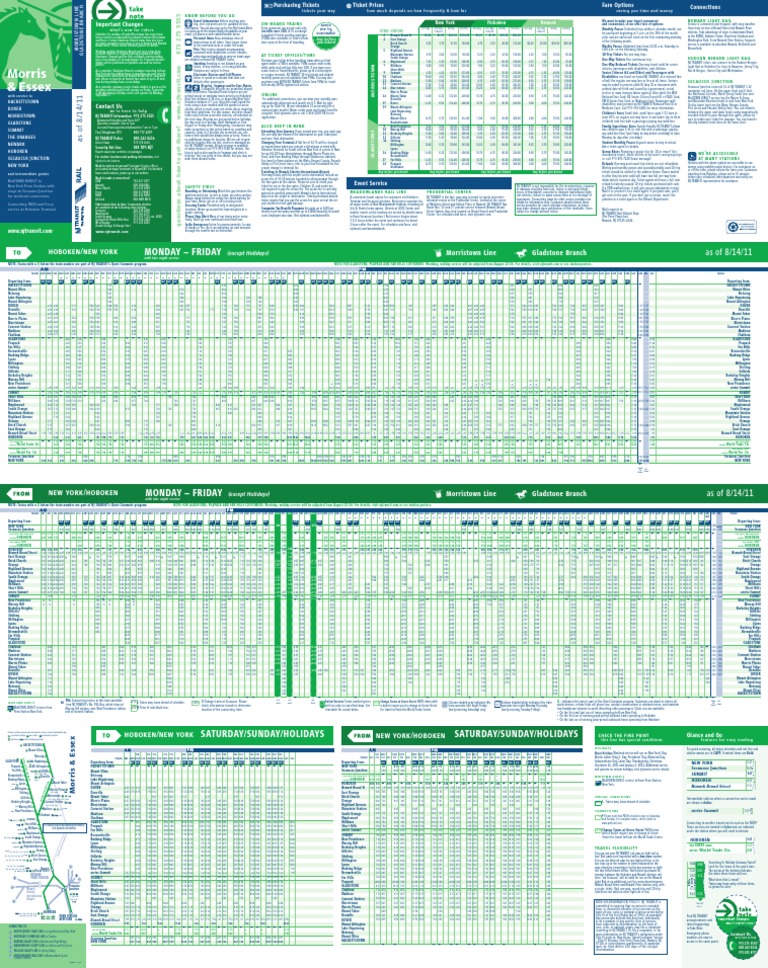
NJ Transit Train Schedule: A Key to Unlocking the Garden State's Transportation Hubs


